Trust in organisations and people

See how much dutch people trust organisations as the police, judges and the European Union

With this dashobard you can make a graph of the dataset "Trust in people and organisations". Int his dataset you will find the amount of trust people place in for instance the police, other people and the church every year. This dataset is made by the "Centraal Bureau voor de Statistiek (CBS)", aka the Central Bureau for Statistics of the Netherlands.
The CBS divided the data in different demographic groups (urbanisation, gender, education etc) and the data is available for the years 2012 throughout 2016. You can find more information (in Dutch) at statline, de online database of the CBS.

This dashboard allows you to make a graph based on a selection of the groups, subjects and years in the dataset. You can decide what group or year goes on which axis, so you can more easily compare different subjects, demographics and years.
For each subject, demographic and year the trust is measured on a scale of 100 points (100 being highest). The graph shows a 95% confidence interval (as calculated by the CBS)

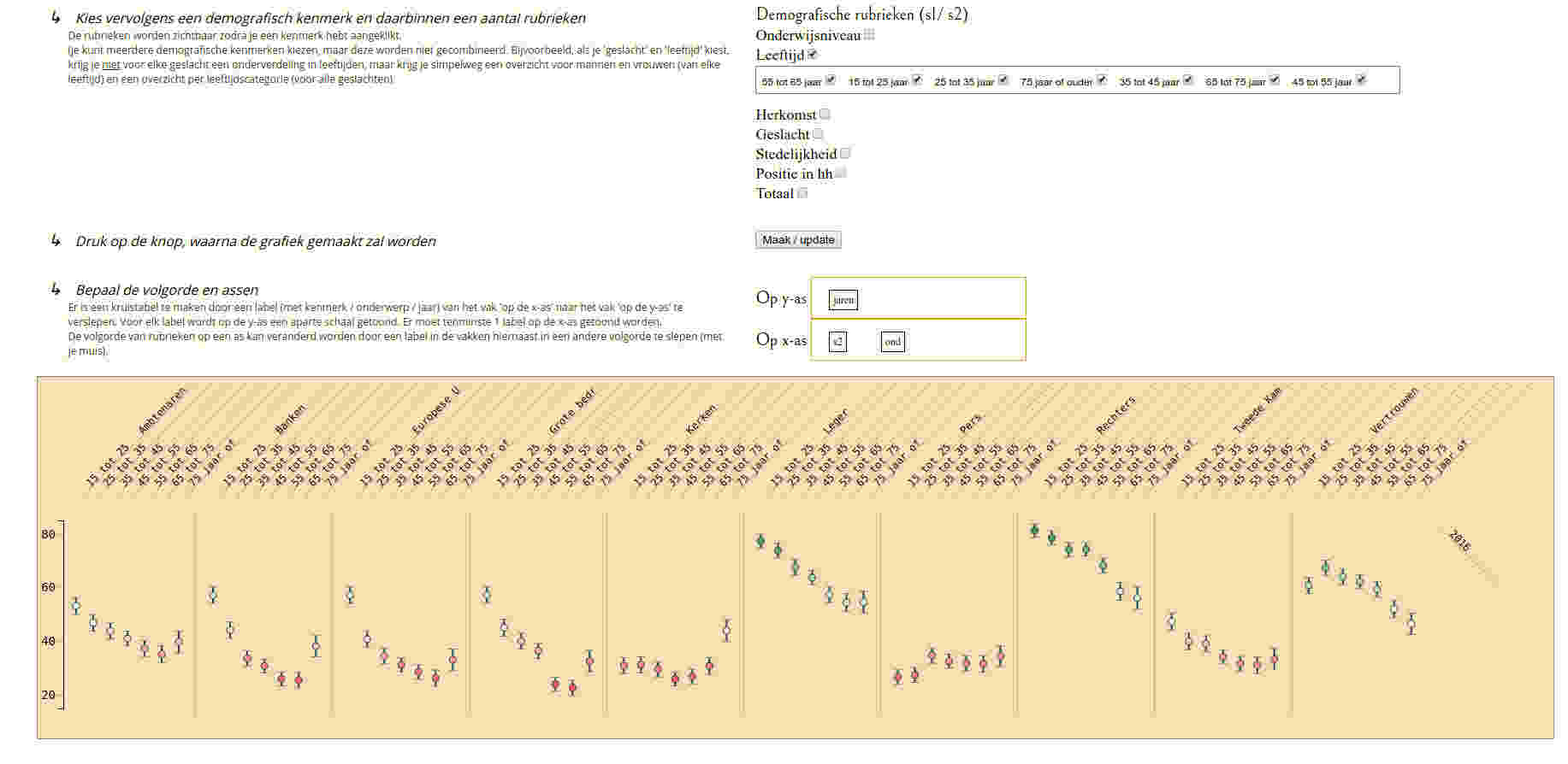
Follow these steps to make a graph

Or click on one of these examples to watch some examples Young and trusting, just not the press or the church High and growing trust in the army, the police, and judges Non western foreigners show more trust except in police and other people No mayor differences between levels of urbanisation Higher education generally leads to more trust, except in banks Trust for each demographic, in each subject for 2016 Man vs Woman: all subjects

First choose one or more subject and one or more years for which you want to show the graph.

Years
Subjects

Next choose a demographic topic en some groups within that topic

The groups will show up after you clicked a topic

(you can choose multiple demographics, but these will not be combined. For instance, if you choose 'gender' and 'age' you will not get a subdivision for age categories for each gender, but instead will get a measurement of trust for men and women (for all ages) and a measurement for each age categorie (for all genders). )

Demographics (s1/ s2)

Pres the button to make the graph

Choose the order and axis

You can make a crosstable by dragging a label (with year, subject of demographics) from the ' On the x-axis' to the ' On the y-axis' (or vice versa) It will show different scales on the y-axis.
You can change the order of the labels on the axis by dragging it to a new position.

On the y-axis
On the x-axis
years subjects s1 s2

Breakdown Notes

Make notes, diagrams and mindmaps in your browser: It's free and requires no registration

Cars in the Netherlands

Eurobarometer

QI guest ratings

World population

Dutch Trust

Stack Overflow Tags

Doodsoorzaken

Bayes animation

Puzzle of the world

History Game