About the data
This graph is based on the data from the stack exchange data dump dated 2017 june 6th, which you can download here
Breakdown Notes
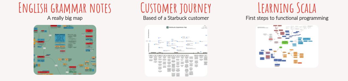
Make notes, diagrams and mindmaps in your browser: It's free and requires no registration
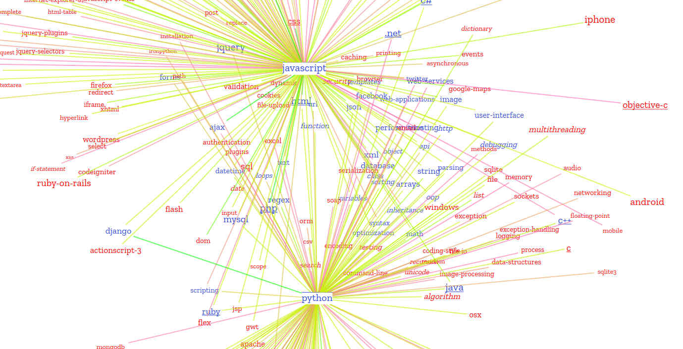
On stack Overflow every question gets tagged. The tags "describe the topic of the question" and "sorts it into into specific categories" according to Stack Overflow. The following interactive and zoomable visualisation attemps to show the most used tags and the relations between them by putting the tags in a network / word cloud.
In the graph, every tag with a count above some threshold is a node.
The distance between the tags/nodes is based on the number of times they have been combined with a question.
Tags that are combined more often, are closer together.
For combinations with a count of zero, there is not explicit distance. Overall these tags do spread out, but in some instances they end up close together.
This can be coincidental, or is caused by having edges to similar important tags.
The most used tags and tags closely related to them get pulled into the center. Less important tags get pushed to the side in groups closest
to the tags they are mosly combined with.
The graph is also a word cloud in the sense that tags displayed with the bigger font size correspond to tags that have been used more often on Stack Overflow.
Because the distribution of tag counts is very uneven (ranging from more then 100.000 to a few hundred) a logarithmic scale is used.
The font style of the tags also says something about the category it belongs to:
Tags that are underligned signify programming languages and tags in italics tags are topics (loops, functions, classes, sorting etc),
though far from everything has been categorised.
When you increase the year, tags that are purple signifies new entries and those pink signifies they have fallen below the threshold.
You can zoom and pan the map with your mouse.
Click on a tag to show the other tags it's combined with most often.
And click on multiple tags to see which other tags these have in common.
Edges colored green are most used and pinkish are least used.
After clicking a graph, you can choose to show only the connected tags by checking 'only show connected'.
You can also filter the threshold, though this will only show or hide some tags and
not recalculate the layout.
The initial reason to make the graph was to show how an ecosystem around for instance javascript changed over time. But you can do more with it.
One might compare languages to see which are similar, for instance by looking for shared tags, or comparing their position.
One might look for tags growing from year to year or how the network of tags around machine learning is forming, or compare azure and amazon-web-services.
The graph also offers a nice way to get a feel for the tags on stackoverflow and see their relative importance (see the graph when hovering a tag).
Do note that the line shows the relative importance and not the absolute number of questions in a year.
This graph works best in recent versions of Chrome or Opera. Other browsers are noticeably slower. Also, the bigger the screen, the better the graph works.
This graph is based on the data from the stack exchange data dump dated 2017 june 6th, which you can download here
Make notes, diagrams and mindmaps in your browser: It's free and requires no registration