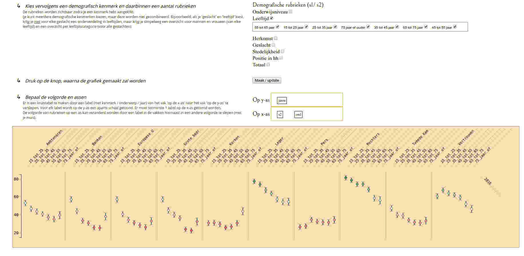
Breakdown Notes
Make notes, diagrams and mindmaps in your browser: It's free and requires no registration

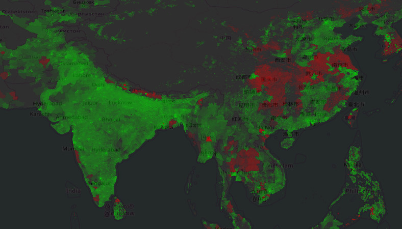
You probably know that the world population is increasing rapidly. You probably can name some countries and region with a growing populations. And you might have some idea about cities, regions or countries with declining populations. For me, it stopped there: I had some expectation, but no overview. To get a better picture of regions declining and growing, I made a map.
The map highlights regions on the rise are in shades of green and regions declining in shades of red (apologies to the color blind). The stronger the color, the stronger the change. The visualisation is an attempt to identify regions that are either growing or declining, not to quantify this. So you will find no scale and should be aware that red and green are scaled differently: in absolute numbers the brightest shade of green has way higher growth then the brightest shade of red has decline.
The map is placed over an openstreet map. By changing the brightness with the buttons on the map you can see the underlaying map better which makes it easier to identify city names, regions etc. You can zoom and pan the map with your mouse.
The data used for this map is based of data from the Socioeconomic Data and Applications Center (SEDAC). (see the full source below the map) Among other datasets they have made available maps and data that "consists of estimates of human population, consistent with national censuses and population registers" as they say so themselves. I have simply substracted the numbers for 2015 and 2000 and scaled it so small differences get highlighted quicker.
Be aware there are 2 versions of the raw maps made available by SEDAC. A normal one, and one adjusted to better align with United Nations population data. In some area's of the world these look different. On this page you can check out the normal one. Check out the adjusted version here.
Generally the map certainly looks like what I expected and changes can be checked against other sources (google search results) Some regions look surprising / suspect and some are not in line with other sources. (what's happening around Qena along the Nile ?, Why is there no growth or decline in Australia (in the normal version)?, Is population in Germany really declining in so many area's ?). Nevertheless I found it interesting enough to share.
This map is based of data made by:
Center for International Earth Science Information Network - CIESIN - Columbia University. 2016.
Gridded Population of the World, Version 4 (GPWv4): Population Count.
Palisades, NY: NASA Socioeconomic Data and Applications Center (SEDAC).
Make notes, diagrams and mindmaps in your browser: It's free and requires no registration